")
")


ZEISS Microscopy


Leibniz Institute on Aging – Fritz Lipmann Institute (FLI)


Leibniz Institute on Aging – Fritz Lipmann Institute (FLI)
Exploring Molecular Dynamics with Raster Image Correlation Spectroscopy (RICS)
In this series "From Image to Results", explore various case studies explaining how to reach results from your demanding samples and acquired images in an efficient way. For each case study, we highlight different samples, imaging systems, and research questions.
In this case study, we explore in vitro molecular dynamics with Raster Image Correlation Spectroscopy (RICS).
Key Learnings:
- Understand how RICS can be used to measure diffusion coefficients.
- Explore the effects of protein size on diffusion speed.
- Learn how RICS can allow you to visualize localized diffusion speeds within an image.
Case Study Overview
|
Sample
|
U2OS cells transiently transfected with GFP oligomers |
|---|---|
|
Task |
Analyze the effects of protein size on the diffusion speed of GFP in cells |
|
Results |
Diffusion speed of GFP is inversely proportional to its size |
|
System |
ZEISS LSM 980 laser scanning confocal |
|
Software |
|
Introduction


Figure 1: Extracting molecular dynamics such as diffusion and concentration from intensity-based images is key in understanding how proteins behave inside cellular environments.
Figure 1: Extracting molecular dynamics such as diffusion and concentration from intensity-based images is key in understanding how proteins behave inside cellular environments.
Molecular dynamics of proteins describe their movement, speed, and diffusion patterns. For life scientists and drug developers, analyzing molecular dynamics can bring insights to understanding cell signaling pathways, membrane dynamics, protein-protein interactions, enzyme function, transport processes, cellular organization, and disease mechanisms.
The rate of protein diffusion can be influenced by many different factors, including protein size, temperature, concentration gradient, solvent viscosity, and protein charge. In a cellular environment, factors such as molecular crowding, cytoplasmic streaming, binding to other molecules, post-translational modifications, and membrane compartmentalization can also impact protein diffusion. Understanding the interplay between these factors and their effects on protein diffusion is essential for understanding how the protein behaves. In this case study, we will discuss how protein size affects the diffusion of a protein in cells.
Multiple techniques used to study molecular dynamics are centered around the principle of monitoring the movement of fluorescent molecules in and out of the imaging volume. One very interesting technology in this category is Raster Image Correlation Spectroscopy (RICS).
RICS leverages the mechanics of the laser scanning confocal, which scans a laser beam across the sample, typically in a raster pattern, and measures the fluorescence intensity at each point. The intensity data is then analyzed to calculate the spatiotemporal correlation function, which describes the correlation between the fluorescence signals at different points in space and time. The spatiotemporal correlation function is calculated by taking the autocorrelation of the fluorescence intensity at each point in the image, and then averaging the autocorrelation functions over all points in the image. The result is a 2D correlation function that describes the spatial and temporal correlation of the fluorescence signals.
To dissect the spatiotemporal correlation further, the spatial correlation function describes the likelihood of finding fluorescent molecules at a certain distance from their current location, extracting the information from the known speed and direction of movement of the laser on the sample. The temporal correlation function describes the correlation between the fluorescence signals at different times, and it is used to estimate the diffusion time of the fluorescent molecules. By analyzing the spatiotemporal correlation function, RICS can extract the diffusion properties of the fluorescently labeled molecules, including the diffusion coefficient. The shape of the correlation function indicates the degree of molecular mobility, with faster diffusing molecules exhibiting little correlation along the slow scanning axis, and slower diffusing molecules exhibiting more correlation. The maximal amplitude of the correlation function indicates the concentration of the molecules.
What makes RICS particularly useful for studying molecular dynamics is its ability to analyze large numbers of molecules simultaneously. This allows scientists to observe the behavior of complex systems, such as biological membranes or cellular compartments with multiple components. RICS is also a relatively fast and easy technique to implement for users with a ZEISS laser scanning confocal, making it accessible to researchers in a wide range of fields.
Material and Methods


Figure 2: LSM 980 system and Spectral RICS module.
Figure 2: LSM 980 system and Spectral RICS module.
For these experiments, U2OS cells were transfected with either 1xGFP, 2xGFP, 3xGFP, or 4xGFP oligomers. The cells were imaged the day after transfection with the ZEISS LSM 980 laser scanning confocal using the solid state 488 nm laser to excite GFP at 1 % laser power. For the RICS acquisition, settings with a pixel size of 50 nm and frame speed of 8.19 μs were used, with a time series of 100 frames (unless explicitly mentioned otherwise). The ZEISS QUASAR detector was used in photon counting mode for the measurements comparing diffusion across the GFP oligomers. Ten cells were imaged for each GFP oligomer. The same cells were imaged with the detector in photon counting and integration mode (5 cells per condition were imaged).
Results


Figure 3: Single images from the GFP oligomer expression in cells.
Nu, Nucleoplasm; No, Nucleolous; Cy, Cytoplasm
Figure 3: Single images from the GFP oligomer expression in cells.
Nu, Nucleoplasm; No, Nucleolous; Cy, Cytoplasm
1) Effects of Protein Size on Diffusion Coefficient
To investigate the effects of protein size on diffusion, GFP oligomers of various sizes were transfected into cells. When looking at the intensity images of the different GFP oligomers (Figure 3), they appear very similar, with progressively higher definition of the nuclear and nucleolar substructures as the GFP number increases in size. To extract quantitative information about the behavior of GFP, timelapses were analyzed with the ZEISS Spectral RICS module. This software addition for ZEISS LSM 980 allows data acquisition and analysis to map mobility, concentration, and stoichiometry of fluorescently labeled diffusing molecules in vitro and in living cells as well as interactions between differently labeled molecules.


Figure 4: RICS analysis of monomeric GFP. A&B: Average spatial correlation function, with each spatial correlation function calculated separately from each image in the experimental image series (A = top view, B = side view). C&D: Data graphs depicting the fit model. C: Surface plot depicting the fit model color-coded for weighted residuals. D: The lower plot depicts the fit model (solid lines), with the parameters optimized to fit the experimental data (error bars). The upper plot shows the weighted residuals.
Figure 4: RICS analysis of monomeric GFP. A&B: Average spatial correlation function, with each spatial correlation function calculated separately from each image in the experimental image series (A = top view, B = side view). C&D: Data graphs depicting the fit model. C: Surface plot depicting the fit model color-coded for weighted residuals. D: The lower plot depicts the fit model (solid lines), with the parameters optimized to fit the experimental data (error bars). The upper plot shows the weighted residuals.
Figure 4 depicts the average spatial correlation function, with each spatial correlation function calculated separately from each image in the experimental image series. The purpose of the RICS spatial correlation function is to inform the user what the likelihood is to find molecules at a distance (ξ, ψ) from their current location, given their diffusion constant and given the fact that the laser is imaging the molecules by raster scanning over them with a given scan speed along a line and between lines. The center correlation point (at ξ = 0 and ψ = 0; Figure 4A) depicts the maximal amplitude of the autocorrelation function, N (Figure 4B). The ξ axis is the fast-scanning axis of the confocal microscope along a line. The ψ axis is the slow scanning axis of the microscope as it scans line after line.
The spatial correlation function surface plot (Figure 4A) provides direct information on the molecular mobility. Fast diffusing molecules will exhibit little spatial correlation along the ψ axis, while slower diffusing molecules exhibit more correlation along the ψ axis. An ideal RICS correlation has correlation both in ξ and ψ, yet more pronounced correlation in ξ than in ψ. This visually translates to faster movements being displayed as an asymmetric, line-like correlation, whereas slower movements as a symmetric, circular correlation function (equal correlation in ξ and ψ). If the correlation is a perfect circle, then molecules do not diffuse significantly within one image scan.
The maximal amplitude of the correlation function (indicated in red, peak of the surface plot, Figure 4B) defines the number (N) of fluorescent molecules in the confocal volume, from which the concentration of the diffusing molecule can be assessed by N = 1/G. The larger the amplitude, the lower the concentration. The standard deviation on the correlation function points that surround the actual correlation (the blue carpet, Figure 4A&B) informs on the quality of the RICS data. The lower the standard deviation (more homogeneously blue and smooth carpet), the better the data.
RICS analysis fits the experimental data to a predefined model to extract the diffusion coefficient (D), and the number of molecules (N). During RICS analysis, for each data point of this average correlation function, the standard deviation is also calculated to allow for error-weighted analysis. In Figure 4D (lower graph), two sections of the experimental RICS data (error bars are the standard deviation) and fit model (solid lines) are shown: the blue section along the fast-scanning axis, G(ξ ,0), and the red section along the orthogonal slow scanning axis, G(0,ψ). In the top part of Figure 4C, the weighted residuals are shown, which are the difference between the data and fit model, divided by the error.
Visual inspection of the fit results allows qualitative assessment of the goodness-of-fit: In Figure 4C, color scaling depicts the weighted residuals. A more intense blue or red color indicates that the fit model value at a given location of the spatial correlation is lower or higher, respectively, than the experimental correlation data value at that location. The absence of any color for a given fit model in the left graph illustrates a perfect fit, i.e., weighted residuals equal to zero. The lower the error on the experimental data, the better the fit model needs to fit the experimental correlation data to lead to a small, weighted residual.


Figure 5a: RICS analysis of 2xGFP.
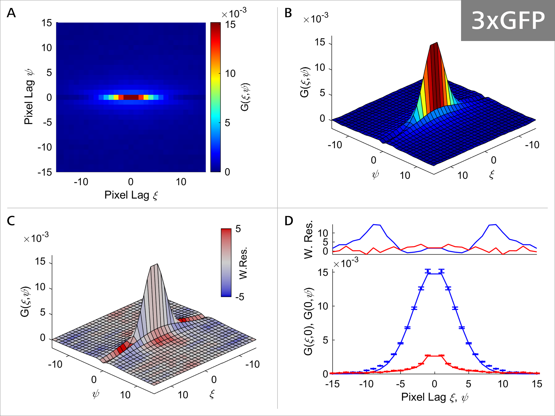

Figure 5b: RICS analysis of 3xGFP.
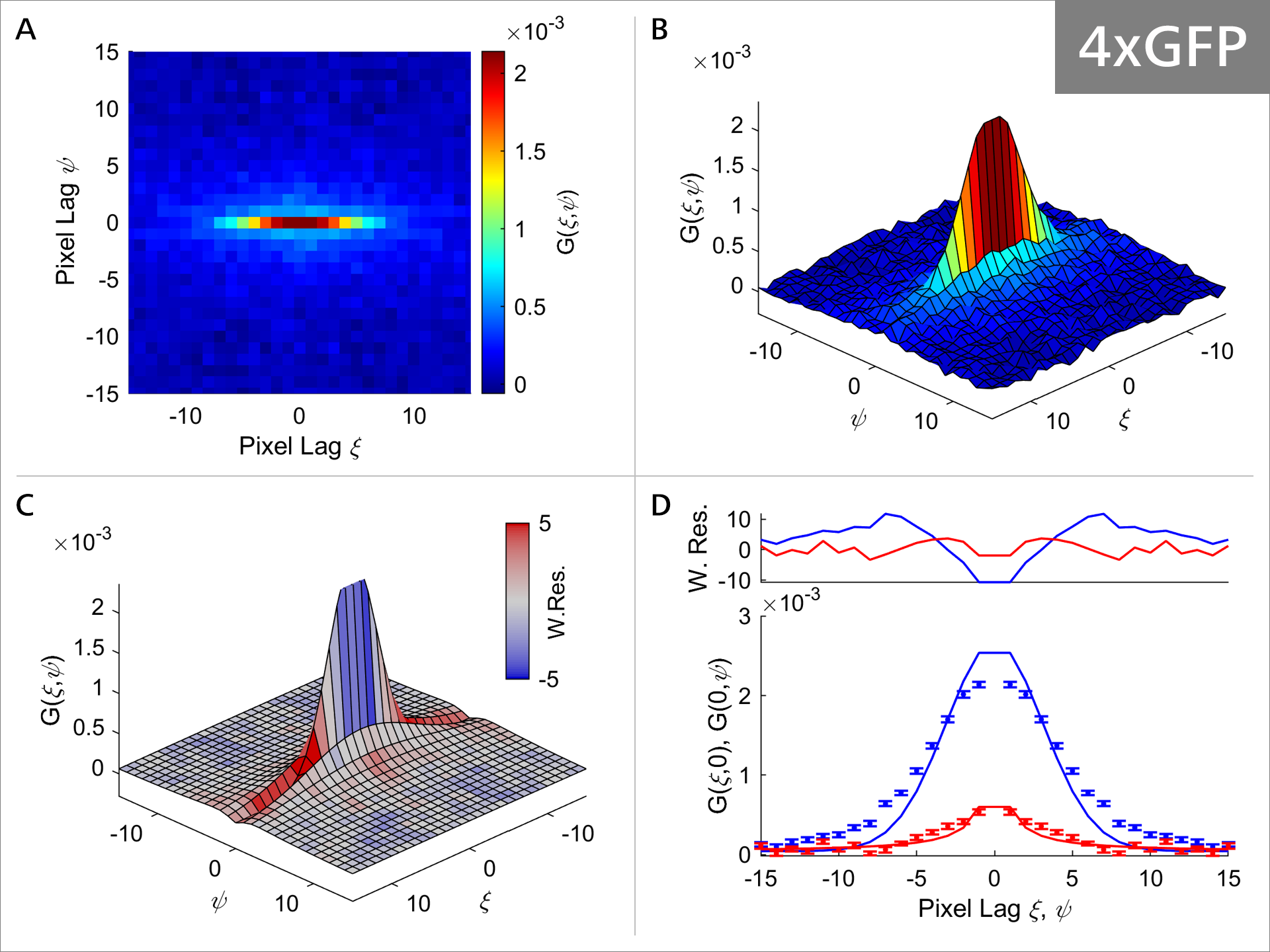

Figure 5c: RICS analysis of 4xGFP.
As the size of the GFP oligomeres progressively increases, the diffusion properties of the molecule also change as can be seen in Figures 5a-5c. Focusing on Panel A and comparing it between 1xGFP (Figure 4) and 4xGFP (Figure 5c), we can see that the correlation function is becoming much more rounded and symmetrical with 4xGFP, indicating indicating that mobility decreases with increasing molecule size. Additionally, comparison of Panel C shows that the weighted residuals are becoming progressively more intensely colored, suggesting that the fit model values and the experimental correlation values are deviating (Figure 4, panel C vs. Figure 5c, panel C). Panel D illustrates that the model (solid line) fits the data progressively worse, with the most obvious example at 4xGFP (Figure 4, panel D vs. Figure 5c, panel D). Collectively these observations suggest that the GFP protein diffusion is strongly impacted as the GFP oligomer length increases.
 for the different GFP oligomers.")
 for the different GFP oligomers.")
 for the different GFP oligomers.")
 for the different GFP oligomers.")
Figure 6: Plot and table of diffusion coefficients (D) for the different GFP oligomers. Unpaired Student’s t-test was used to compare the average D between 1xGFP and 2xGFP, 2xGFP and 3xGFP, 3xGFP and 4xGFP. The fold and percentage decrease were calculated to express the degree of decrease in D relative to the smaller GFP oligomer. N=10.
Figure 6: Plot and table of diffusion coefficients (D) for the different GFP oligomers. Unpaired Student’s t-test was used to compare the average D between 1xGFP and 2xGFP, 2xGFP and 3xGFP, 3xGFP and 4xGFP. The fold and percentage decrease were calculated to express the degree of decrease in D relative to the smaller GFP oligomer. N=10.
To quantify this qualitative observation, the diffusion coefficient (D) for the GFP oligomers is plotted with a standard t-Test to compare D between the different GFP oligomers. The statistical analysis reveals that there is a significant decrease in the diffusion coefficient of GFP after each size increase. The decrease in the diffusion coefficient is proportional to the number of oligomers added, with D decreasing by 66-78 % each time an additional oligomer is added.
 for the different GFP oligomers for the same cells imaged in Photon Counting and Integration mode")
 for the different GFP oligomers for the same cells imaged in Photon Counting and Integration mode")
 for the different GFP oligomers for the same cells imaged in Photon Counting and Integration mode")
 for the different GFP oligomers for the same cells imaged in Photon Counting and Integration mode")
Figure 7: Plot and table of diffusion coefficients (D) for the different GFP oligomers for the same cells imaged in Photon Counting and Integration mode. Student’s t-test was used to compare the average D value between Photon Counting and Integration mode. There is no statistically significant difference in D between the two imaging modes.
Figure 7: Plot and table of diffusion coefficients (D) for the different GFP oligomers for the same cells imaged in Photon Counting and Integration mode. Student’s t-test was used to compare the average D value between Photon Counting and Integration mode. There is no statistically significant difference in D between the two imaging modes.
2) Photon Counting vs. Integration Mode Effects on Diffusion Coefficients
When imaging with a laser scanning microscope, the signal is collected by the detector. The detector can be operated in either photon counting or integration mode. The choice between the two modes depends on the specific experimental requirements and the characteristics of the sample being studied.
Photon counting mode is typically used when the sample is relatively dim, and the signal-to-noise ratio needs to be optimized. In photon counting mode, each detected photon is precisely counted, which can be used to calculate the diffusion coefficient of the fluorescent particles in the sample. Photon counting mode is also useful for detecting low levels of fluorescence, as the sensitivity of the detector is typically higher than in integration mode.
Conversely, integration mode has a higher dynamic range, making it the preferred choice for brighter samples. In integration mode, the detector integrates the signal from each pixel over a certain period of time, resulting in a continuous output signal that represents the average intensity of the fluorescent particles in the sample. Integration mode is useful for measuring the distribution and concentration of fluorescent particles in the sample, as it provides a more accurate measure of the average intensity of the fluorescence signal.
To investigate if the mode of detection affects the calculated diffusion coefficient, the same cells were imaged with ZEISS Spectral RICS in both photon counting and integration mode. The RICS analysis revealed that there is no significant difference in the diffusion coefficient calculated regardless of the mode of acquisition. This provides evidence that either mode of the detector can be used to accurately characterize protein behavior.


Figure 8: Grid-based Heatmap. A. Intensity image of timepoint 0 in the RICS timelapse. Nucleoli are indicated by arrows, ER is indicated by an asterisk. B. Grid-based heatmap, 32x32 sectors. The color bars indicate the range of diffusion coefficient values. Grid elements which cannot be analyzed due to the lack of usable data are shown in black.
Figure 8: Grid-based Heatmap. A. Intensity image of timepoint 0 in the RICS timelapse. Nucleoli are indicated by arrows, ER is indicated by an asterisk. B. Grid-based heatmap, 32x32 sectors. The color bars indicate the range of diffusion coefficient values. Grid elements which cannot be analyzed due to the lack of usable data are shown in black.
3) Diffusion Across Subcellular Compartments
Previously, we showed how the number of GFP oligomers affects the diffusion coefficient of the protein, however, cells are not homogeneous environments. Cells are composed of compartmentalized and compact structures with barriers that restrict protein diffusion. The diffusion coefficient discussed so far represent the average speed across the entire image, which covers a large part of the cell.
One of the greatest advantages of using RICS is that it can provide positional information along with the molecular dynamics information by performing Grid-based heatmaps. In this type of analysis, the image is divided into small sectors and RICS analysis is performed consecutively in these sectors. The resulting parameters are displayed in heatmaps overlayed on the original image. Grid-heatmapping requires a high signal-to-noise ratio, therefore it is necessary to select brighter cells, image in integration mode, and acquire longer timeframes.
The cells expressing 4xGFP were selected for this experiment since subcellular structures are more pronounced due to the size of the protein hindering diffusion. A bright cell was selected and imaged in integration mode for 300 frames. As seen in Figure 8 (left), the nucleus, cytoplasm, nucleoli (labelled with arrows) and endoplasmic reticulum (ER- labelled with asterisks), can be easily visualized in the intensity image. After the analysis, the grid-based heatmap (32x32 sectors; Figure 8, right) shows how the GFP diffusion varies throughout the cell. The heatmap is color-coded for diffusion coefficient, with red and blue representing faster and slower diffusion coefficient, respectively. The heatmap reveals that GFP is diffusing slower inside the nucleoli (darker blue color) compared to the nucleoplasm (lighter blue). Additionally, the diffusion in some areas of the nucleoplasm is faster (red) compared to areas of the cytoplasm (blue). Grid elements that could not be analyzed due to lack of usable data are shown in black, which in this case coincides with the ER (asterisk). One reason for this may be the constant movement of the ER which doesn’t allow for spatial cross correlation analysis. Other parameters, such as the number of molecules and concentration, can also be analyzed with grid-based heatmaps, allowing visualization of the parameter of interest in different cellular compartments.
Conclusion
This case study discusses how RICS can uncover molecular dynamics, specifically diffusion coefficient, in cells, and how it can measure the effects that protein size has on its diffusion coefficient. The RICS analysis revealed that the diffusion coefficient decreases with increasing GFP oligomer size, with D decreasing by 22-34 % each time a GFP monomer is added. Additionally, this case study demonstrates how grid-based heatmaps can allow visualization of diffusion coefficient variation throughout cellular compartments.


